
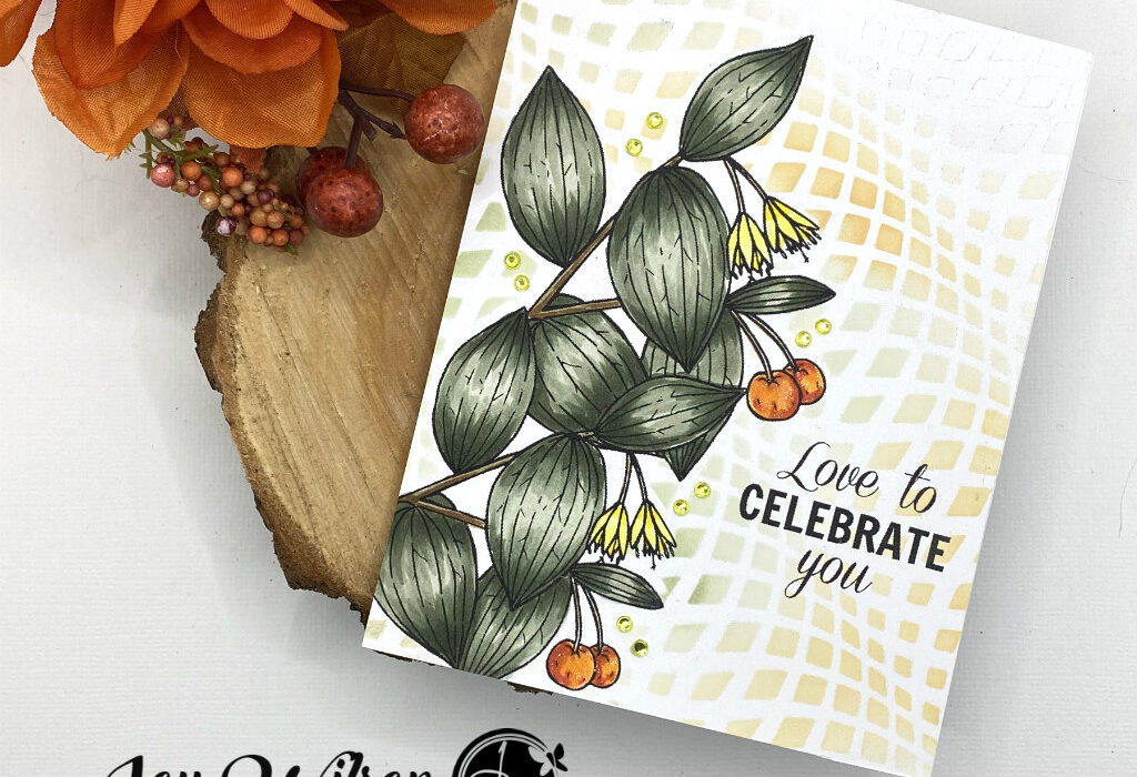
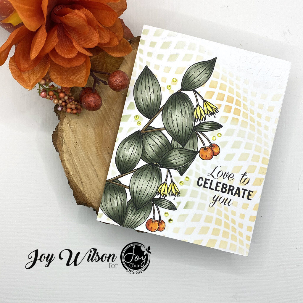
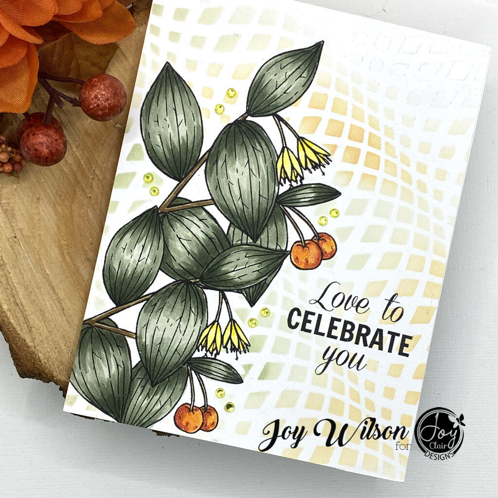
Hi and welcome back! I am so glad you visited today, because I am sharing an Anniversary card I made for my husband! My card showcases Blessed and Grateful, a new release this month that features traditional Autumn images. I love it because you can make beautiful masculine cards with it. I sometimes struggle with making masculine cards, like so many others, but Blessed and Grateful doesn’t disappoint! I think the key to masculine cards is picking the foliage images or coloring the floral images in darker non traditional feminine colors.
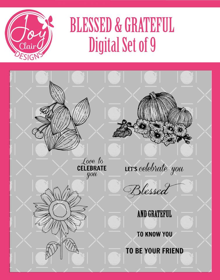
Before we talk about the design process, let’s take a look at the stamp set!
Design:
I designed my card in photo shop elements and chose to use the foliage image twice in my layout. I love digital stamps such as the Blessed and Grateful set because you can size and manipulate the images. Do you notice how the berries are oriented to the left? I “mirrored” the image by using the free form tool. There are other free programs out there that you can use to obtain the same results. In addition to mirroring the images I changed the sized and layered the images over themselves by moving one image to the back.
Coloring:
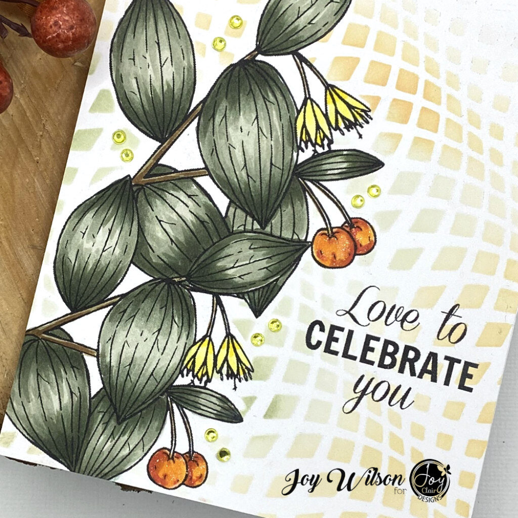
I chose four colors in the same color family to obtain the shading and highlights in the individual leaves. I chose the BG 90 family of Copic markers because they are my favorites tones, but you can choose what suits you. Anywhere you see a leaf overlap, you add the darkest color to form a shadow. I also used a flicking motion with all four colors to get a nice texture, but smoothed the lightest color over the entire leaf to get a good blend. My last step was to go back in with the darkest color to add final textures because that can get washed out with the blending.
Adding Interest:
To add more interest to this one layer card, I cut out a mask of the Blessed and Grateful stamp set and temporarily tacked it down with Pixie Spray so that I could stencil over the image and make it appear to be behind the focal image and sentiment. I chose subtle hues of the same colors used in the foliage to accent the card. If you notice blended the distress oxides in areas where the colors complimented one another, which keeps the eye moving. For final touches I added a few gemstones to add shine.
One Last Look:
For more inspiration from the team and our fans check us out on social media:
–Joy Clair Designs Facebook Page
–Color By Faith Facebook Page
–Joy Clair Stamp Project Facebook Page
–IG
–Pinterest
get crafty with Joy
Joyfullystamps
FB
IG
Pinterest
carol gill
Gorgeous card love the beautiful stamps and fabulous colouring-great shading–Happy anniversary to you both
Carol x