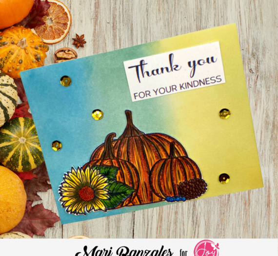
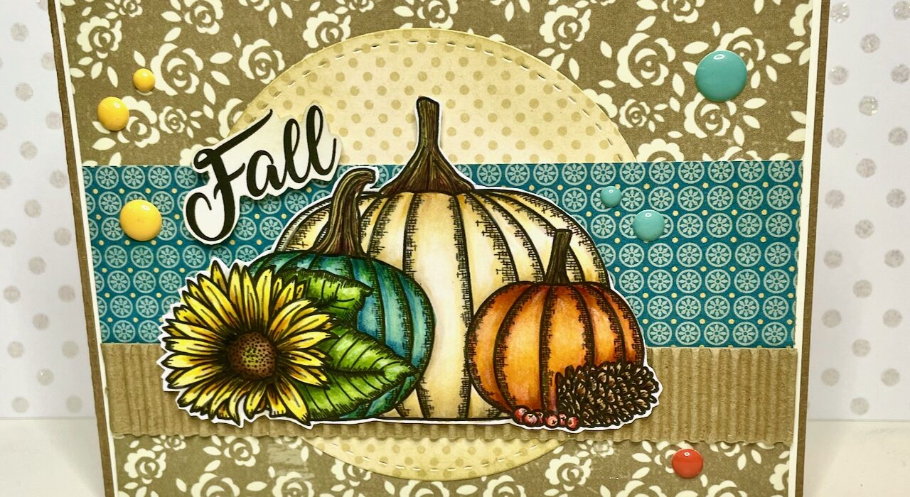
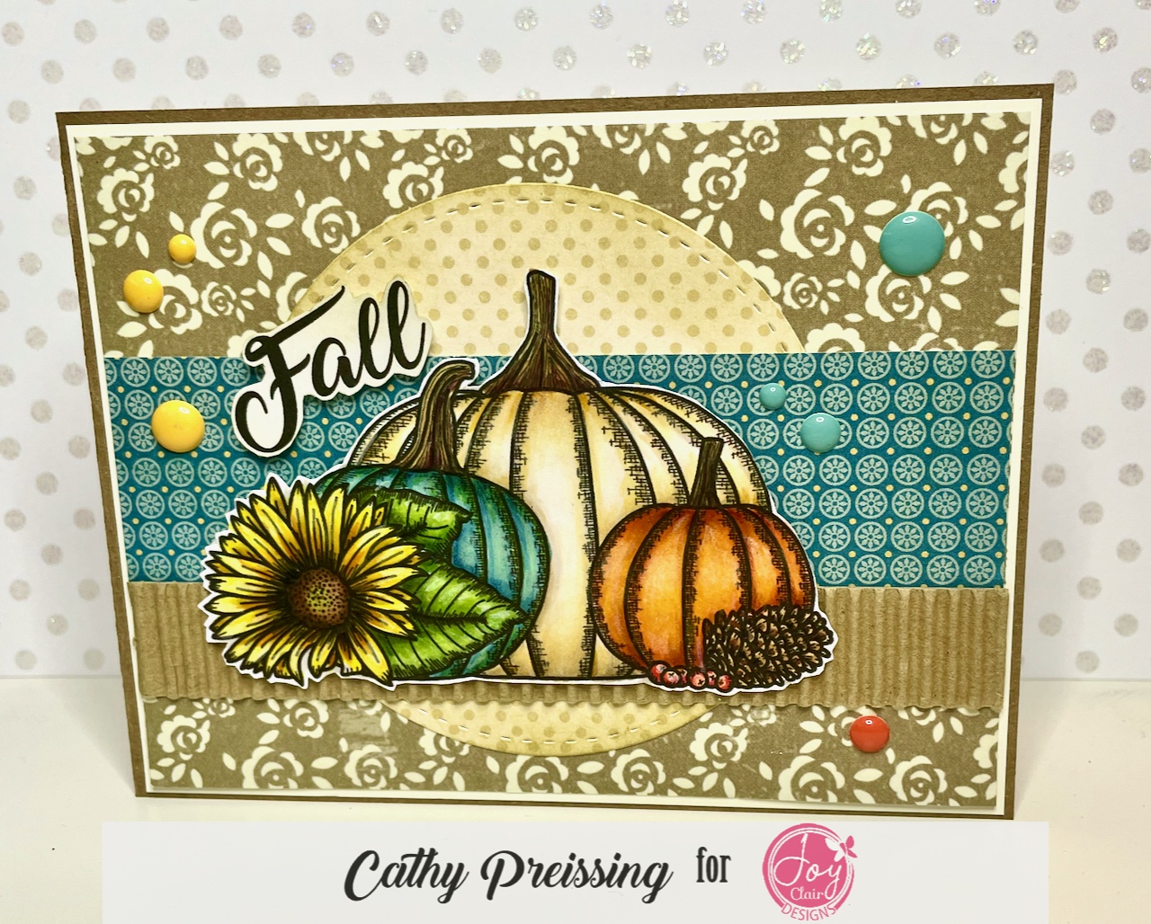
Hello and happy Sunday, Joy Clair fans! Cathy here, with today’s card. This one features the 4×6 stamp set, Hey Pumpkin – which is available in the Joy Clair Designs Store. The fall season is quickly approaching where I live in MN, so the change in colors outside is reflected in the cards I am making inside! The collection of pumpkins from the Hey Pumpkin set just begs to be colored, so I pulled out my markers to jump into fall and try a little bit of realistic coloring with my Copics!
Coloring with Copics
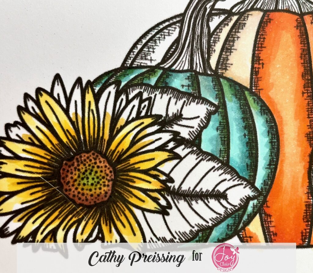
First off, I stamp an image multiple times to allow me to “play” around with color choices, design, and shading. The September Mood Board influenced my card, so I knew the pumpkins would reflect that palette. Once I made color choices, I needed to figure out where those colors went. A variety of questions popped into my head as I colored: Should I put the orange pumpkin in the center or the side? What if I add green to the center of the sunflower? How can I increase the contrast and shading in my coloring? Do I want to use YR or R01 to add depth to the sunflower? Having a “draft” image (or two) gives me the freedom to play around and experiment with these questions like these. Then, when I am satisfied, I color on my “good” image.
Adding Colored Pencils
Finally, I bring out my Prismacolor Premier colored pencils to add another layer of shading and highlights. If my coloring seems “off”, it’s often because I don’t have enough contrast from the light to dark of any given color. Using colored pencils as a final touch can helps me achieve the contrast and variation I am looking for.
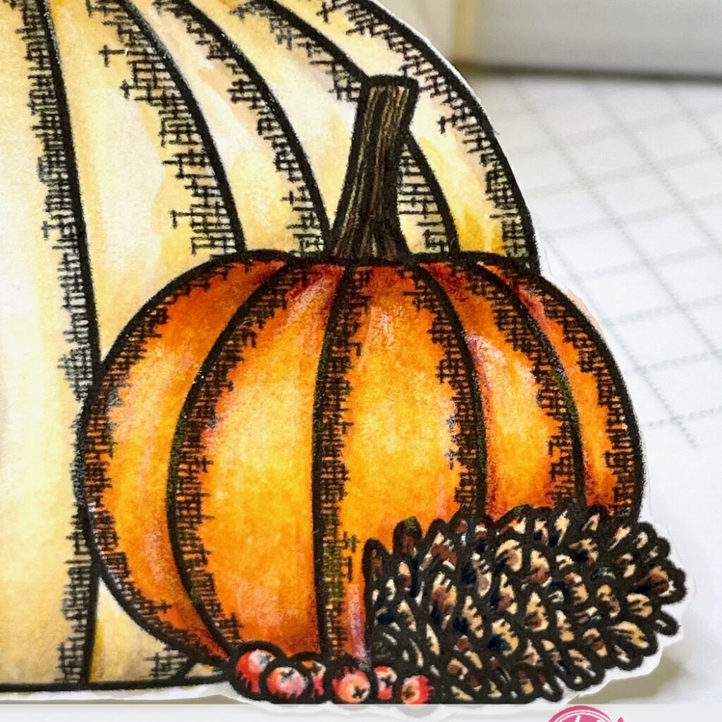
This close up zooms in on my final coloring. I added white colored pencil for highlights and Dark Purple Prismacolor pencil (#PC931) to deepen the shaded areas of the pumpkin and the berries. If you scroll up to the whole card, take a look at blue pumpkin, Can you spot dark blue? If you do, it’s Prismacolor Indigo Blue (#PC901). I rarely have a card that doesn’t use these two colors. They are workhorses in my collection of colored pencils. Additionally, Light Umber (#PC941)and White (#PC938) for the off-white pumpkin.
Coloring the image is just the first step in making my card!! The final steps are fussy-cutting the image, choosing a sentiment, and selecting patterned papers from my collection. You can find more examples of this kind of realistic coloring with Copics and Prismacolored pencils on my blog or IG page.
Follow us!
Be sure to sign up for Joy Clair Designs newsletters. You will receive notifications of new releases, sales and exclusive offers for subscribers. You can also follow the team’s Joy Clair Designs creations on Facebook Page, Joy Clair Stamp Projects Facebook Group, Instagram , Twitter, Pinterest and YouTube!
Thanks for taking a closer peek at my card. I hope you are able to make time to be creative in the coming days! ~Cathy